"How To Create An Informational Website Architecture" Thing
How To Create An *Informational Website Architecture (IA)
There are those interactive shops that use IA's as a way price jobs. Some use this information to create wire-frame templates, page scenarios and test prototypes against. There are those who use IA's to figure out how the website will interrelate with complex database structures or legacy applications. There are those that use IA's to qualify and test their usability, informational flow and make assessments about the amount, location and type of content being used. And lastly, there are those who use IA's to simply sell and scope the work to the client. Naturally it's best to understand that they can be used in the "E - All of the above" category. Ergo – engage this post!
Wikipedia describes and IA as:
"Information architecture (IA) is the art of expressing a model or concept of information used in activities that require explicit details of complex systems. Among these activities are library systems, Content Management Systems, web development, user interactions, database development, programming, technical writing, enterprise architecture, and critical system software design. Information architecture has somewhat different meanings in these different branches of IS or IT architecture. Most definitions have common qualities: a structural design of shared environments, methods of organizing and labeling websites, intranets, and online communities, and ways of bringing the principles of design and architecture to the digital landscape."
With all that said the greay area here is MASSIVE of just what truly is an informational architecture. There are so many different types of architectural differentiations that it can get quite confusing.
Just as an example there are architectural documents on:
- Business analyst
- Enterprise architecture
- Enterprise Information Security Architecture
- Data architecture
- Information design
- Information system
- Interaction design
- Knowledge organization
- Knowledge visualization
- Process architecture
- User experience design
- Web indexing
- Website architecture
We're going to be spending our time talking about Website Architectures. More specifically in today's interactive lexicon we call these documents 'informational design documents'. While you as the newbie or senior architect may not require all architectural documents in order to complete your website it's best to construct at least the primary foundation.
Informational design can be used for an amazing array of things including (but are not limited too):
- A sales tool
- To test a creative brief against
- To inspire and direct a copyrighter
- To inspire and direct a developer
- To inspire and direct a designer
- To use as a comparative measurement against competitor sites
- To phase jobs and assess budget thresholds
- To select and insure proper technology usage
- To insure proper modularity of a website
- To construct project scheduling against
- Can be used in testing, quality assurance and usability efforts
- A scope-creep device; change orders and client guide
Getting started:
- First off (I'm going to assume you have a site that your working or intend to submit an RFP against) write down every page that is on the current website for overhaul.
- Next, do you some in-depth due diligence on your competitors websites. Write down and construct a comparative matrix of pages/information you thinka re good, bad and or worthy of a consideration set to the next version of your web presence. Rank each item them 0 - 5. This does not give navigational priority, simply gives reference to compare against.
- Now go to sites that you consider utilizing 'best practices' with your industries discipline. Example would be, you sell hand-made jewelry online; look at the best eCommerce websites such as Amazon.com, Ebay,com and others. What pages make the site functional and easy to use? What content makes the items enticing for purchase? Write down all the pages and site a small detail of their importance.
TIP: Often if you're comparing a boatload of sites you can jump to the bottom of the page and see if they have a site-map. A site-map is a page that lists all (or most) of the pages within their site and typically their navigational importance. Navigational priority will later become very helpful in how and what content goes where in your website. - What you should now be left with is a sea of page titles, details and a vague idea of where certain content will [might] go.
- Next, start with the home page, or the page that will lead you into the area that your creating a flowchart for. It's safe to say that if your constructing a flowchart for a micro-site or new area of a larger site that there may not be a "home page" by definition. Now slowly sift through all the content you think should go on the site and its priority and start a hierarchical structure. Each column under the main (home) page will be a "sub home" page, and all pages below will become simply "sub" pages. You can delta your material even further into 'subsets,' but it's not recommended as your will be increasing difficulty on the usability and therefore making assumptions on your audiences technical proficiency. The "K.I.S.S." (Keep It Simple Stupid) should be your mantra.
A basic Website list [might] go something like:
- ACME CO. Home Page
- Newsletter signup
- RSS Feeds
- Social Media Links
- Rotating Product Line
- Specials (Call-Out)
- Submit Your Photos!
- Follow Us on Twitter
- "Latest News" - blog post
- Sub Navigation Items (example: ACME CO., PRODUCTS, SERVICES, NEWS & EVENTS, SPECIALS, CONTACT)
- Footer Navigation Items (example: SITEMAP, LEGAL, ADVERTISE, WHOLESALE, CONTACT)
- © Copyright your home page and the internal pages are protected under it
You can see in just this quick example that you're starting to crowd up a single page in a hurry. This is why defining your architecture is so important.
 From the Top Down & The Left to Right:
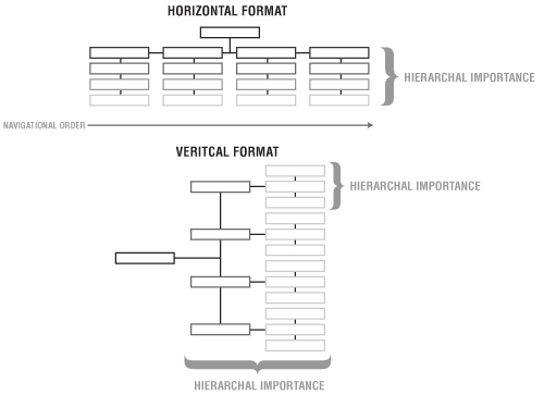
There are two typical styles of IA. One is horizontal flowchart (recommended) that shows hierarchal importance from top to bottom, and left to right.
The second is a horizontal IA that has the home page on the left and then delta's out to the left, putting the hierarchal importance to the top. Either style is fine, but I seem to have the most success explaining sites to clients with the first version.
Define your architecture:
Defining your document with top line mandatories such as:
- Client & Project Name
- Date
- IA Version (this convention should change every time the IA changes, so it's your third revision it should be labeled v3. or v1.3 dependent upon complexity and differentiation from the previous)
- Comments (given that the client, or your team internally had made comments, note them here
Create a key:
A key is like an map key, it's a set of iconography that allows for you to give detail to an area with just a small succinct image.
![]()
Here are a few that I use on my own to detail various parts of the overall structure:
- Downloadable Files – This would be a page(s) that might contain a series of PDF or other documents you want available for download.
- Registration Page – This would symbolize a page that would require or have a registration component to it.
- Auto-Rotating Functionality – An image(s) that would rotate through or be randomly generated upon reload.
- Multiple Pages – This one is key, it's used to notify that there are more than likely many pages within the given section your outlining.
- Secure Pages – Page(s) requiring password protection.
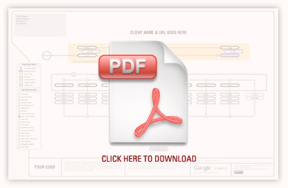
Please see the attached PDF (below) for a larger list.
Define server technology and analytics:
If you're a shop that is specific to a development language, server technology, analytics package or proprietary application please be sure to note it somewhere in the IA for your own protection.
Legal:
Somewhere begin the overly tedious process of protecting your ass with some legal verbiage that says, that this is a copyright protected document and that should you make changes to it after the final approved version that it will be 'client notified.' There's tons of free legal/contractual resources for you on the internet – see my Delicious links for more.
Last couple of thoughts as you embark out on your new education:
Red flags to be mindful of:
- No one wants to click more than four deep for their selected content (Home/Sub/Sub-sub/detail)
- Users hate to wait
- User don't want to be forced into a linear digestion of information
- Don't break the navigational pattern(s)
- Users hate to hunt (UNLESS it's part of the conceptual experience)
- There's no such thing as a "Back" button anymore
- Users interest level [usually] goes like this:
- Home page - I want it now, I want it brief and I want it concise
- What out for long sub-navigational strings; if you can try to break up isolated areas of heavy content
*I'm not claiming that any of this information is fact or legally bulletproof, it's worked for me for 15 years, but USE AT YOUR OWN RISK you ungrateful bitches.
Additional Resources:
http://www.adobe.com/products/illustrator/ - For the most visual control, by creating your own 'system' utilizing Adobe Illustrator
http://www.omnigroup.com/applications/OmniGraffle/ - Another great application (with flowchart capabilites) for a MAC
http://office.microsoft.com/en-us/visio - The super hardcore informational development tool for PC (please note this is not a user friendly application)
http://flowchart.com/ - online flowchart software
http://www.gliffy.com/ - online diagram software
http://writemaps.com/ - online site-map software
Great Educational Overiew of the flowchart process:
http://www.jjg.net/ia/visvocab/
