Google Browser Size: A Cool Tool For The New School
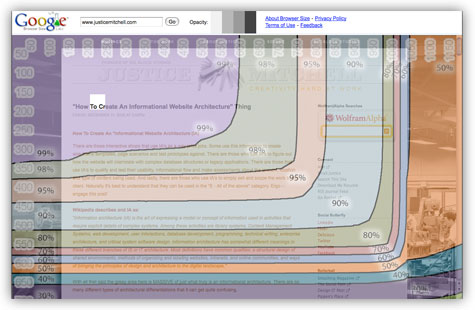
Website designers, statisticians and advertisers alike should take a quick peek at the new Google Browser Size tool. It's nice as a quick reference tool to see where various parts of your website are falling at it comes to not simply usability, but user attention.
"This is useful for ensuring that important parts of a page's user interface are visible by a wide audience. On the example page that you see when you first visit this site, there is a "donate now" button which falls within the 80% contour, meaning that 20% of users cannot see this button when they first visit the page. 20% is a significant number; knowing this fact would encourage the designer to move the button much higher in the page so it can be seen without scrolling."
More from the Google development team.
